
This is a technique I picked up from Kent Beck. In order to expand your understanding of a problem space and generate new ideas, it’s useful to put what you already know on a plot. It can be one, two or three dimensional and you can experiment with different axis (continuous, discrete, binary).
Here is a simple example.
Automated Tests
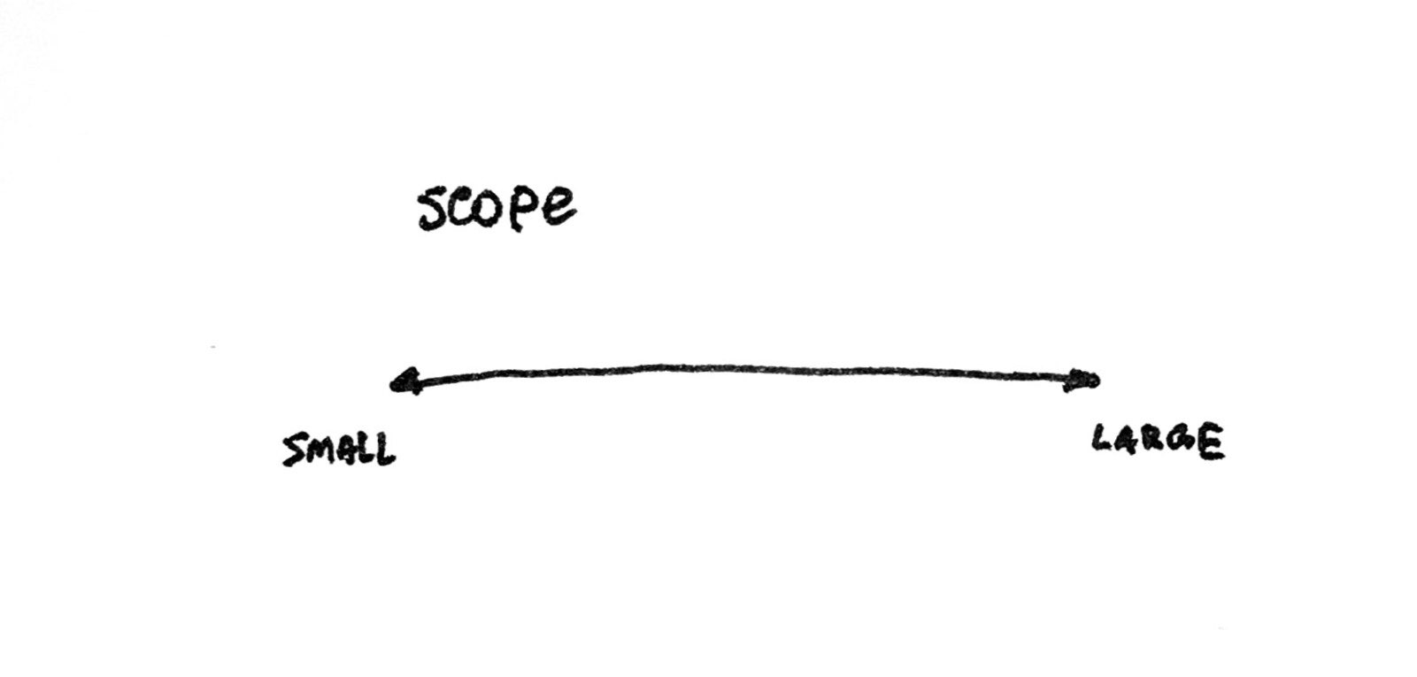
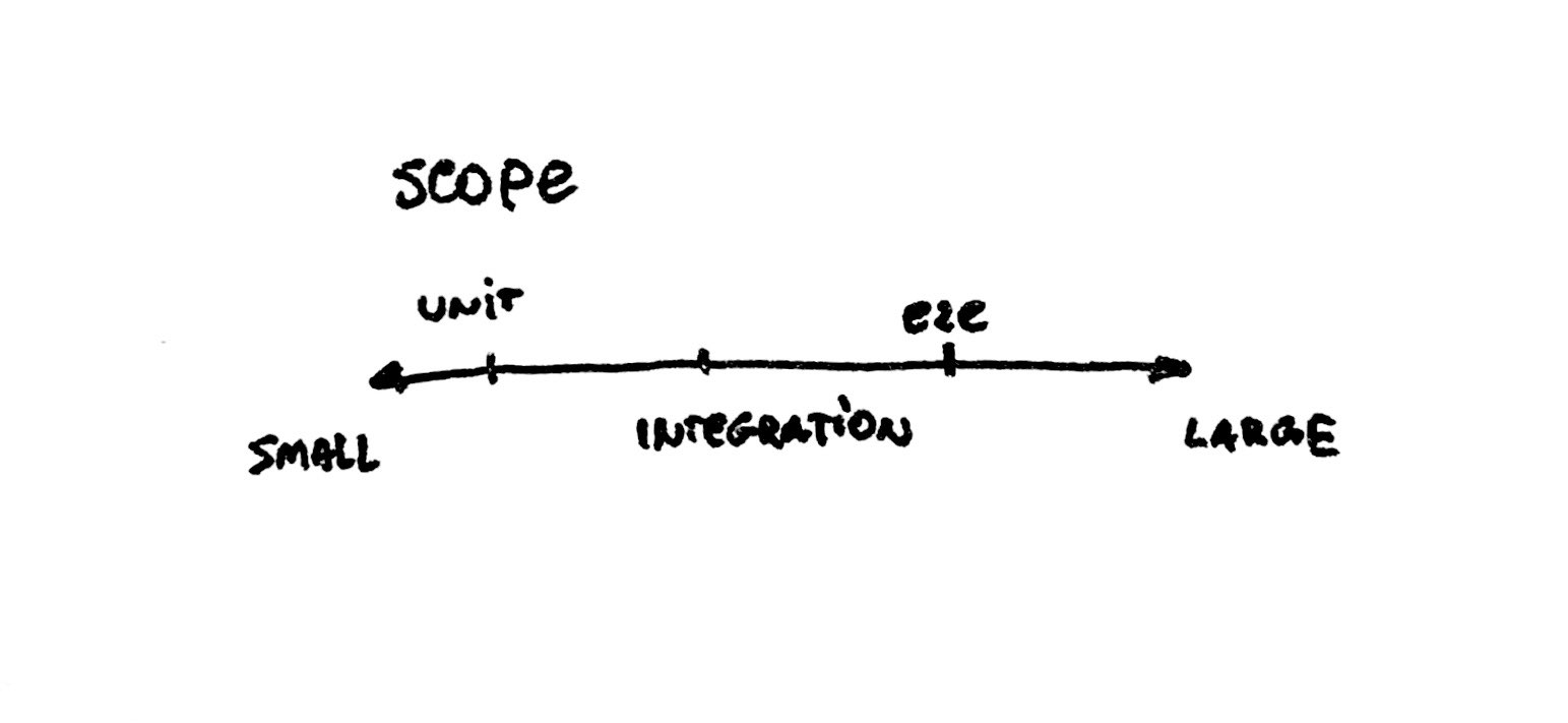
How many types of tests do you know? Say it’s unit, integration and end-to-end tests. Now let’s pick an axis (just one for now) – scope, from small to large.
- Unit tests will be on the left side (small scope, testing an isolated small piece of the system).
- Integration tests will be somewhere in the middle (testing how a few small pieces come together).
- End-to-end tests will be on the right side (asserting the whole system works as intended).
Organizing concepts this way helps us better understand the bigger picture. But it can also suggest some new ideas. All you need to do is ask a question:
Given a point on the plot, what concept does it represent?
This forces us to think beyond the concepts we already know.
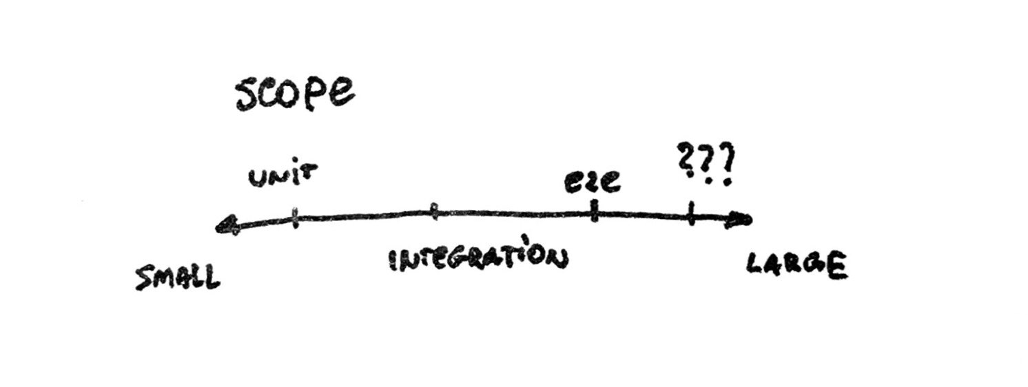
In the tests example, what would be to the right of end-to-end tests? Well, something with a larger scope than e2e. Maybe tests that involve whole data centers and networking.
How about further down to the right? Impact tests (not sure if this exists already), that measure how our change influences the business revenue or social good from our app.
We could also add another axis (feedback latency, feedback quality, cost) which will literally add another dimension to our reasoning about the problem space.
If you’d like to see more examples, check out Kent’s notes:
- The Product Development Triathlon (definitely read this one)
- Making Making Manifesto
- Feedback Goes Further Than I Thought
- Bits, Clumps and Just Right