Many programmers hate making slides. The most common argument I hear is IANAD – I’m not a designer. I’ve got a few practical tips on how to make slides in Keynote (Powerpoint, etc.) that will help deliver great visuals for your next meetup or a conference talk.
I love making presentations. Ever since I was introduced to Powerpoint '03 I strived to make original and fun content. I’m also lucky to have some of the best teachers in the world. I’ve given a bunch of talks at conferences and meet-ups, but also quite a few internally at Facebook.
I believe the main function of a slide deck is to engage and entertain your audience. If you are looking for more practical and information-focused presentation tools, check out excerslide and the like.
With the 80/20 rule you don’t actually have to be a designer to make a great slide deck. 20% effort will get you 80% there. I’ve sorted tips by what I think is the best value proposition – easy to fix but have big pay-offs.
1. Aspect ratio
Nothing stands out more than a wrong aspect ratio of the slide content. I’m talking about the dark area near the edge of the slides:
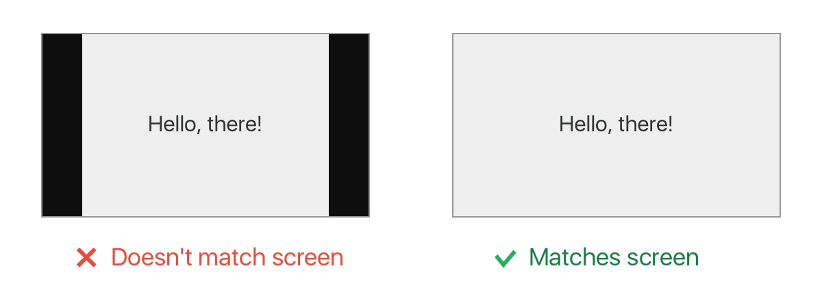
This happens when the slide deck aspect ratio doesn’t match the one of the projector. There are 2 common aspect ratios that projectors support: 4:3 and 16:9. Ask the conference/meet-up organizers for the one their equipment is configured for.
Same applies for images. Getting rid of extra spacing and showing images edge-to-edge makes them 10x more appealing. Just a small detail that makes a big difference.
2. Small pieces of content
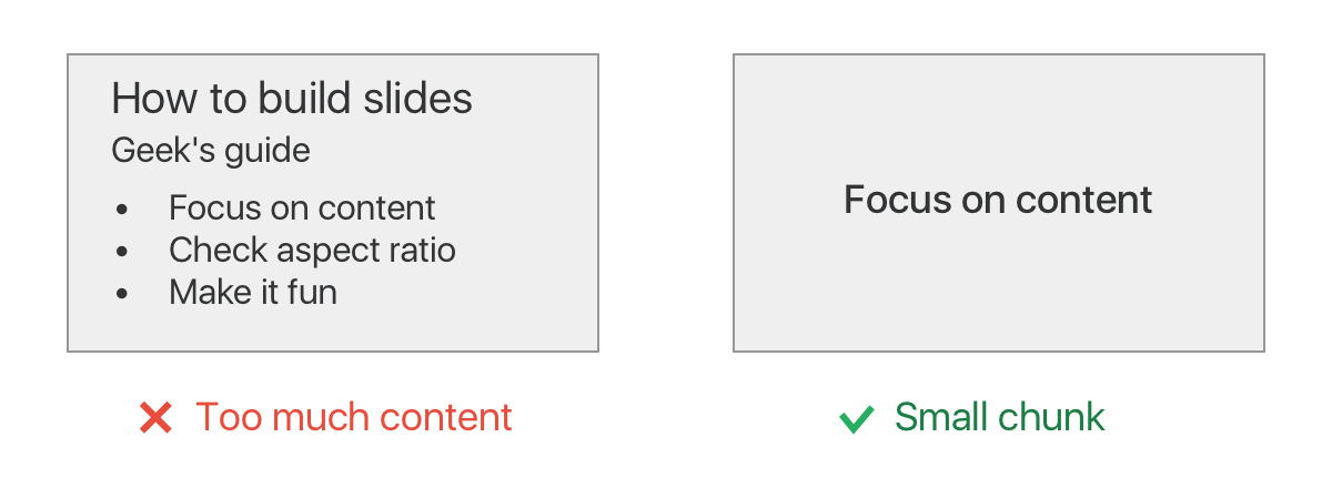
When people see a wall of text they start reading through it and stop paying attentions to the words you say. Even if there is not much text but you have all bullet points visible, people will scan through them faster than you will talk through them. Use shorter phrases and show your bullets list one-by-one.
If you use slides content to guide the exact words you are going to say, you are doing it wrong. Use speaker notes instead! The audience won’t see it and you can put as much stuff there as you want.
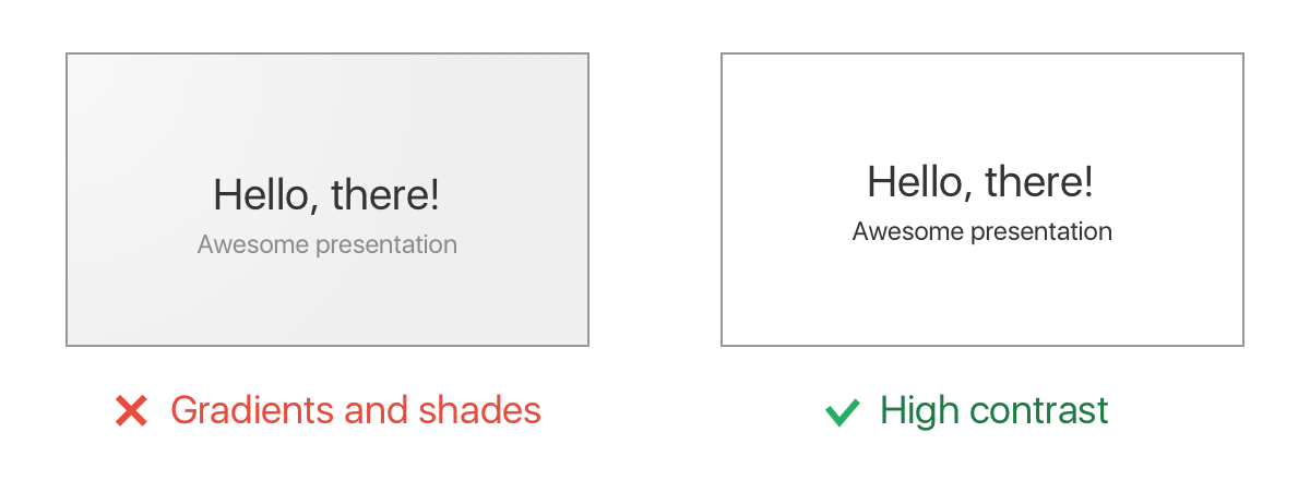
3. Contrast color scheme
The main rule – your slides have to have high contrast. Fine-tuning colors is useless because the colors will look different on the projector anyways. The internet is full of pre-made color schemes, e.g. Flat UI. But keep the number of distinct colors low. Ideally have one for background, one for foreground, and maybe one to highlight the most important bits.
Dark or light color scheme? Whichever you prefer. Keep in mind one detail though: if the talk is going to be recorded, you don’t want to have a high contrast between your face and the slides behind you. For dark rooms use dark background, for bright rooms use light background. Easy.
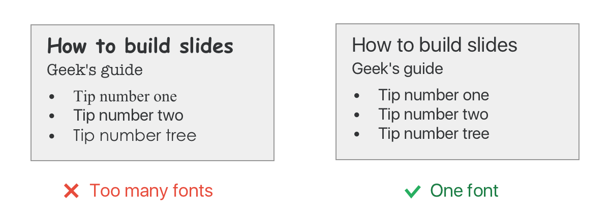
4. Consistent font
Unless you really really care, stick to the standard ones. Consistency is way more important than the exact font family you use. Font size is important too, generally the larger the better.
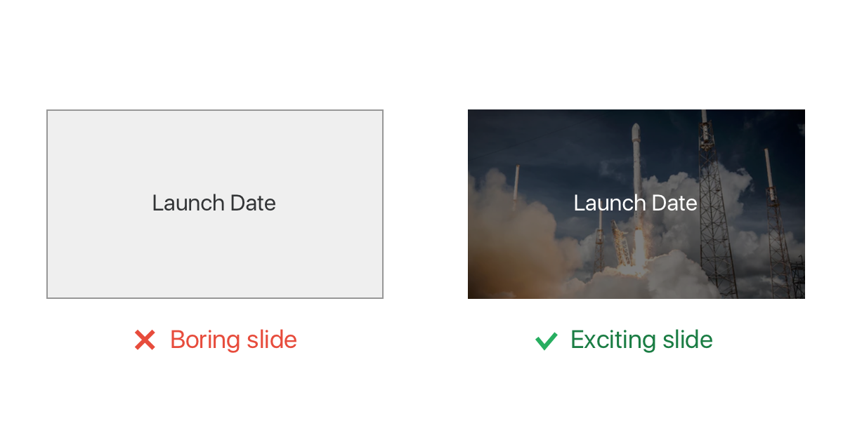
5. Awesome images
It’s very easy to make an awesome background for your slides. Find an image on unsplash (or any another CC0 image stock), resize it to cover your slide edge-to-edge (while keeping the image’s aspect ratio), move it to the back and adjust opacity to N%.
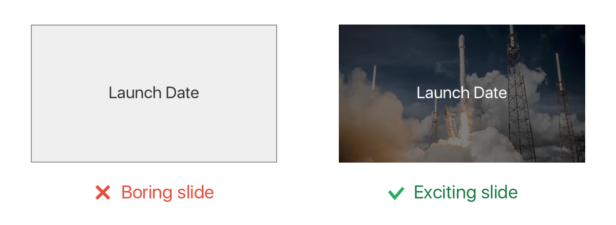
But never ever stretch the images to make them fit. It’s better to make it bigger and crop than to have a distorted image.
6. Magic move
In general it’s best to keep animations at minimum. They are hard to configure and look clowny when used in a wrong context. Also Keynote’s default settings for most animations are terrible – they are way too slow. By the time your 2 second animation finishes, the viewers will be half way through their Twitter feeds.
However, there is one area that benefits from having animations and it’s very easy to do – slide transitions. From the overwhelming list of different styles Keynote provides, I recommend using two: Push and Magic Move.
Push animation is useful when you want to make some of the slides feel like they are part of a big canvas. For example, if you have a long timeline of events that don’t fit one slide, you can continue on the next slide and make it transition in with a push animation.
Magic Move is the secret sauce. It can animate between two slides by looking for similar objects on each slide and automagically figuring out the way to transition between two. It’s like React – you tell it what you want and it will figure out how to get there. I recommend using Magic Move for explaining how things change or relate to each other.
Prefer shorter animation durations (0.5 seconds or less), they make the presentation feel more energetic. Also experiment with acceleration, often it helps to adjust these too.
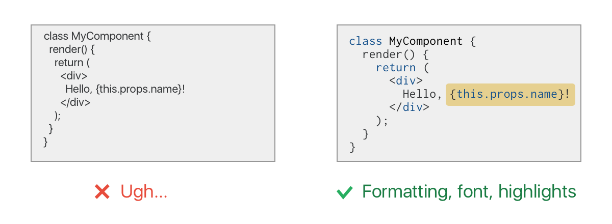
7. Code samples
Programmers LOVE code samples. Seeing a few lines of code is worth a thousand words. I wish more presenters included relevant code examples in their talks. Tip #2 applies here as well, don’t put more than a few lines of code on one slide. If more code is needed for context make sure to highlight the important pieces (using brighter colors, putting a box around it, etc.)
And please please please use a monospace font for code samples. Nothing looks more upsetting than a code sample in Times New Roman. While we are here, syntax highlighting helps a lot too.
8. Use templates
If you are using Powerpoint or Keynote for your slide deck and think it’s too hard to adjust every slide, remember that these tools have a concept of master slides or templates. You can design or configure a master slide once and use it as a base with different content later on. It’s like generalizing copy-pasta code into a reusable function. Once you learn the true power of templates, the slide making software stops being a pain.
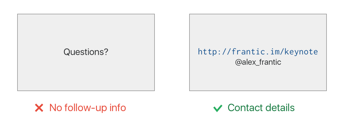
9. The last slide
The final slide is more important than you think. If you are taking questions after the talk, it’s likely that the last slide will hang around for quite some time. Put some information there that you want people to remember, like your name, Twitter handle or a link to stuff you’ve been talking about. Don’t put more than 3 items though.
Bonus points: publish the presentation (with speaker notes) and add its URL to the final slide.